


UI/UX Design, Research,
User Interview, Wireframes,
Prototyping, Usability Testing
Figma, Miro, Invision, Zoom
16 weeks
For employers, hiring has always come with time-consuming logistics: screening resumes, interviewing candidates, and scheduling follow-ups. With so many steps in the hiring process and so few candidates being kept in the loop, I wondered how I could help employers meet candidates' growing expectations.
How might we support job seekers throughout the hiring process while keeping up with increased expectations for communication and organization?
Design a mobile platform that connects job seekers to employers so they can stay organized and updated during the hiring process.


Secondary research
Competitive analysis
Survey
User interviews
Affinity map
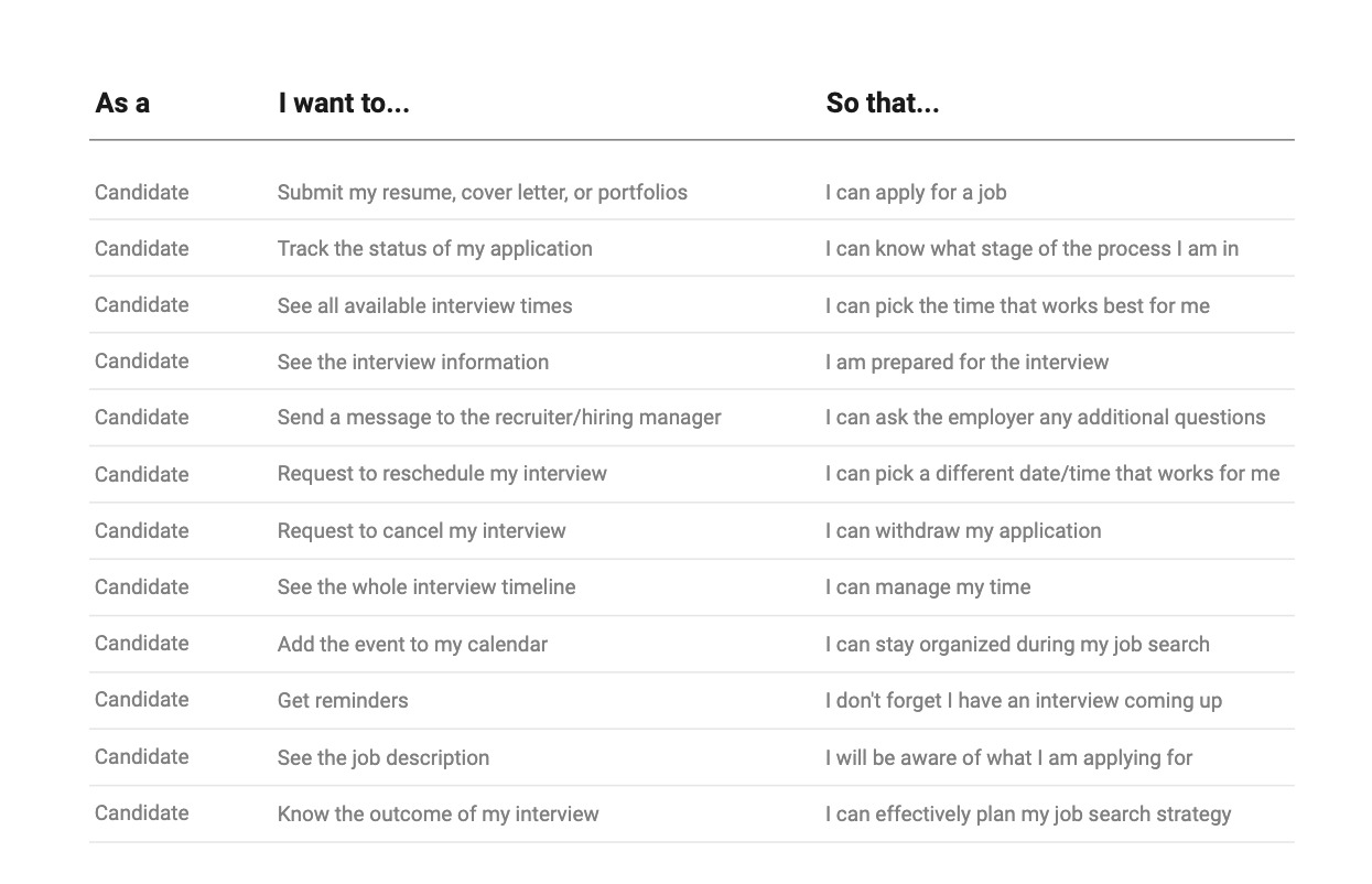
User stories
Personas
Sketch
User flows
Wireframes
Mood board
Visual design
User testing
In order to fully understand the scope of the problem I wanted to tackle, I began by conducting research. First, I looked online to find articles and case studies to get a better understanding of my users and the problem space the problem exists in. I then analyzed 3 apps and websites that were solving a similar problem, with each competitor solving a different focus of my overall problem. Through secondary research and user interviews, I discovered a need to create a more positive candidate experience.
In CareerPlug's 2023 Candidate Experience Report, 500 participants across 11 industries are surveyed regarding their experience during the hiring process from the job seeker's perspective. While communication is a two-way street, it is important for employers to set the trend and follow up with candidates. Setting this precedent can reduce ghosting from both sides and strengthen communication to build a better relationship with candidates. The study also weighs in on specific areas that employers can focus on to improve the hiring process:
21% of job seekers advised for more transparency in the hiring process
20% of job seekers advised for clearer and more accurate information about the job and responsibilities
19% of job seekers advised for improved communication between both parties
11% of job seekers advised for improved speed and organization of the hiring process
CareerPlug's survey data made me question how I could create a tool or features that would address these areas of concern and help people feel confident in their job search.

.png)
To find participants to interview, I posted a screener survey on LinkedIn and Springboard's Slack channel. I received a total of 26 submissions from people who were of various employment statuses and had experience applying for a job.

From the screener, I narrowed down the interview participants to those who met the following criteria:

Over the course of two weeks, I remotely conducted 5 interviews to get a clearer understanding of my users and their needs when applying to jobs. In order to uncover the frustrations of the current hiring process, I prepared 19 open-ended questions, focusing on the target users' values, motivations, and expectations. Throughout the design process, I referenced back to my insights and findings to ensure my design decisions remained user focused.
User interview goals:

Interviewees expressed dissatisfaction towards at least one part of their candidate experience but attributed the frustration as being a normal experience of the job search. Their thoughts on improving the current hiring process revealed a need for a simple, centralized way to fill in the gaps that were causing miscommunication and disorganization.


Key findings:
In order to remain aligned with the users' needs, goals, and behaviors, I created 2 personas - one for the job seeker and one for the HR professional. I used insights from my user interviews to compile the common goals and pain points for each persona. By creating two personas that represent opposite user segments, I was able to prioritize designing features that were critical for each use case.


It was now time for me to start brainstorming possible solutions for the problems I uncovered in my research. I focused my solutions on solving the following How Might We (HMW) statements:
With these problem statements in mind, I began exploring different ideas and visualizing my solution.

Knowing which details job seekers tended to look back on most, I organized the key information for each applied position under application status, job description, and company page. With this, users are able to stay informed throughout the process.
.png)
I modeled the pathway to give a similar feel as when making changes to an online restaurant reservation. This feature allows for a faster and easier method to reschedule or change scheduled interviews by eliminating time-consuming back and forth communication.
.png)


I started looking for inspiration to define my ideas, focusing on the keywords: professional, job, confidence, opportunity, and time. With the ideas defined, I then chose a color palette and typography that reflected my mood board. I utilized blue as the primary color to represent professionalism and dependability and keppel green as the secondary color to show optimism. For the typography, SF Pro Display offers a neutral and flexible sans-serif typeface that supports a variety of weights and is legible in different sizes.

I conducted a round of usability testing with my hi-fidelity prototypes to determine if my design provides users with the appropriate resources when applying to jobs. My goals were to see if users would be able to use the app to easily check the status of their job application, how they would respond to the organization of the dashboard UI, and if users found the most important pages to be at the bottom of the navigation bar. I recruited five participants for my testing through friends and the Springboard slack channel. The participants were a mix of male and female, in their mid-20s, and all tech savvy. All five test sessions were moderated and done remotely.
When asked to reschedule their upcoming interview, most users forgot what their original scheduled time was. Because the original time wasn’t on the screen to select a new time, users were forced to recall what was on the previous screens. Users then had to return to the previous screen to check what the original time was.
To resolve this issue, I added the original time on the "Select a Time" screen so that the information was visible for users. With the information readily available on the screen, users no longer needed to rely on recall.

When users tried to reschedule their interview, they noticed that there wasn't an option to propose a new date/time if they are unavailable on the given dates/times.
To resolve this issue, I added a call to action at the bottom of the "Select a date" screen. This directs users to message the employer if they want to coordinate a new date/time.

Using the feedback provided in my two rounds of usability testing, I then moved on to design the final screens in Figma. I specifically focused on creating an organized space where users could easily navigate through the copious amount of information given to them when searching for a job.


Intervieweez was my first design project where I took on various roles from beginning to end. Although I have experience as both a job seeker and a HR professional, I learned that I needed to put aside my assumptions to better understand my users' motivations and values as they differed from my own.
As I stepped into each role for different stages of the design process, I learned new skills and worked with design tools that I hadn't used before. Despite each stage being a new challenge, I learned that the focus remained the same: designing with the user in mind.
Add a status quick view for each job on the “My Jobs” screen so candidates can view the status without having to click into the job.
Include a function for users to add notes for each stage of their application's status. This will allow job candidates to prepare for the next step in the hiring process.
Show motivational quotes or helpful interview tips to keep job seekers motivated during their job search.
.png)