


Research, Ideation,
Prototyping, User Testing,
UI Design
Figma, Miro, Zoom
5 days
As part of the Springboard curriculum, I participated in a modified Google Venture design sprint. The design challenge centered around CityPups, a startup that helps people living in cities find the perfect dog to adopt. Specifically, people living in the city struggle to find the right dog to adopt due to their unique needs. Additionally, with the vague information provided on adoption websites, people don't feel confident finding a dog that will be a good match for them and their lifestyle.
Adopting a dog is never a simple decision that can be made on a whim. For people living in cities, various factors such as small living spaces, limited access to dog-friendly outdoor spaces, varying work schedules and modes of transportation need to be considered.
How can people feel confident that they've found a dog they feel connected to and matches their lifestyle requirements?
Design a tool where users can input their requirements to filter potential pet matches, creating a personalized user experience and eliminating the time spent on browsing.
To better understand the problem, I began by reviewing the existing research, persona, and user interview provided by Bitesize UX.
.png)

I then synthesized the research in an affinity map to visualize the direction that I wanted to take my design. As reoccurring themes began to emerge in my affinity map, key insights started to come together:

Using the research insights, I started sketching maps of possible end-to-end solutions. After creating a few possible maps for the user flow, I decided that the following best addressed the problem and conveyed my solution.

I began day 2 by visiting existing websites that were either direct competitors or would provide inspiration for ways to help users match with adoptable dogs. Naturally, I started my search by looking at competitor websites such as adoptapet.com, aspcameetyourmatch.org, and petfinder.com. After getting inspiration from how adoption websites create their matches, I then branched out to other websites that had similar quiz features such as Sephora’s foundation matching and HGTV’s interior design quiz.
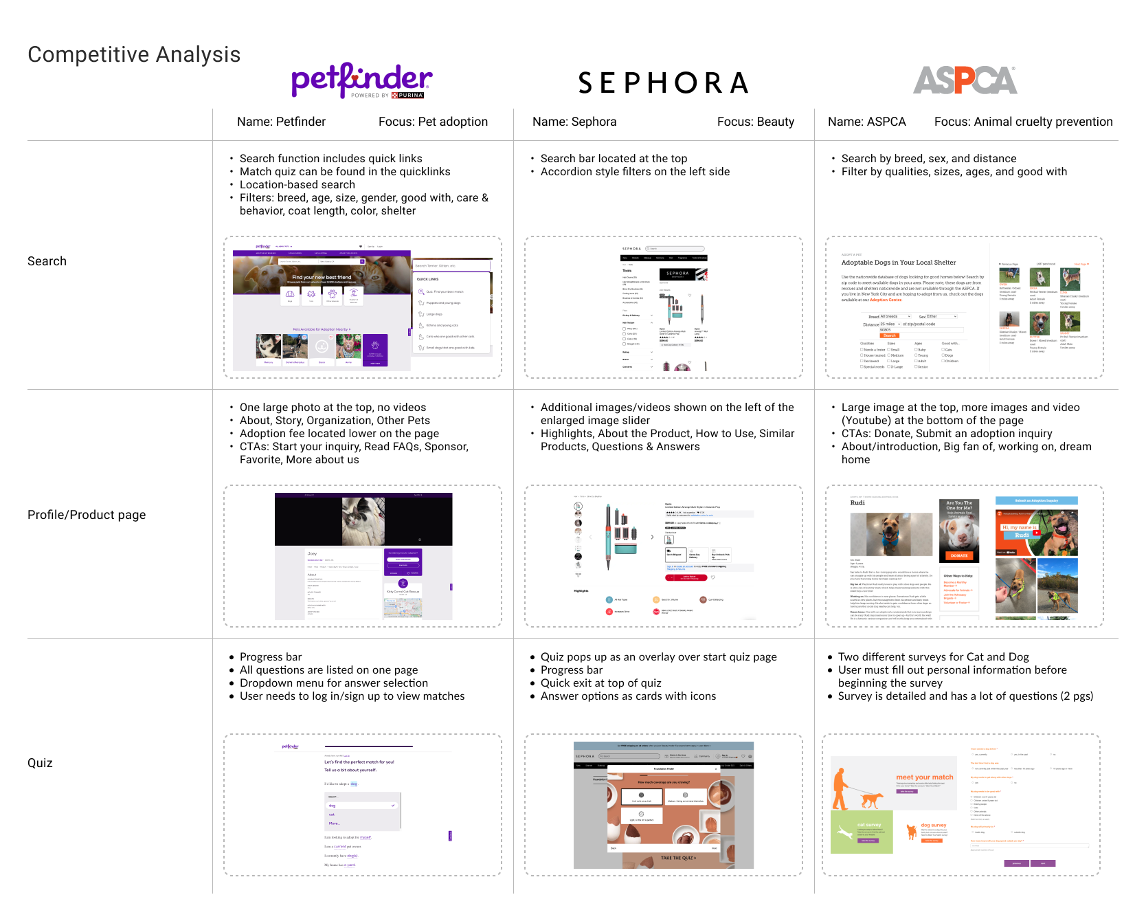
Upon visiting the pet adoption websites, they all greeted me with a large search feature that prioritized filtering by location, breed, and age. Although 2 of the 3 websites had a match quiz feature, it wasn't prioritized and the CTA couldn't be found upfront on the homepage. The quizzes were presented in a list/survey and provided me with a good sense of what questions needed to be asked in order to find a match between the user and adoptable dogs.
When I initially thought of adding a match quiz tool, the first website that came to mind was Sephora because of the variety of quizzes (foundation, hair, lips, skin care, etc.) offered on the website to help users find their perfect beauty product match. Secondly, I looked at interior design quizzes which helped users picture which interior design themes would work best in their homes. In contrast to the pet adoption websites, Sephora and HGTV's quiz features utilized photos or icons to help the user visualize each answer choice - something that the current direct competitor websites for CityPups lacked.
While each website had its own strong point in getting to know the user and matching them for the end result, I felt that I could create a better experience by combining them. The most critical screen that I wanted to focus on was the quiz/survey to get to know the user and their expectations when looking for a dog to adopt. Once I decided on the flow that I wanted to design, I spent 30 minutes sketching 8 possible solutions for CityPups’ quiz screens.

After reviewing all the possible solutions from my Crazy 8s sketches, I decided to move forward with the design that incorporated pictures into the answer choices. I believed that the pictures would allow users to better imagine their potential dog and how the dog would integrate into their current lifestyle. As opposed to having a lot of questions presented in a list format, this solution challenged me to condense the number of questions that could be asked. I wanted to ask the most important questions needed for pairing, but didn't want to make the quiz too long and have users drop off before completing it.

Before starting my storyboard, I narrowed down the important questions that I wanted to ask users in order to understand their needs. I narrowed down and finalized 12 questions that I thought would give necessary insight into the users' needs and expectations when looking for their ideal dog. Then I used the 12 questions to create the quiz for my storyboard, with each question being on a separate screen. I chose to have each question on separate screens so that I could use pictures to provide the user with more context. At the end of the quiz screens, the user is then shown their results with all the dogs that have been matched to them based on their answers. Finally, they are able to view each dog’s details and can then contact the adoption agency/shelter or proceed in submitting an application.
I first transformed my sketches into quick low-fidelity wireframes before proceeding with the high-fidelity interactive prototype. I focused on creating a simple user flow for the quiz, starting from the homepage and ending on the dog's profile page. While the quiz focuses on understanding the user and what they are looking for, the dogs' profile goes more in depth into the dog's personality. For the profile page, I included a large image with videos, and divided the content sections into facts, about me, characteristics, story, and options to inquire more details if needed. All the necessary information is presented upfront so that the user doesn't leave with unanswered questions or needs to spend additional time calling the shelter.
The CTA button is placed upfront in the hero to invite the user to engage with the match quiz.
The user can explore all pets available for adoption by using the search function and filtering by location, age, and breed.
The quiz offers a quick, simple, and engaging experience to help the user find their perfect match in just a few minutes.
The use of images on the answer cards help the user visualize the dog and how it could fit into their lifestyle.
On the left, an overview of the user's answer choices are shown to eliminate the need to recall their selections from the quiz.
Additionally, the user can further narrow down their quiz results by breed, color, and health.
The section for ideal home size allows the user to visualize the space needed for a dog of a particular size/energy.
Sections are separated into:
• Things to know
• Characteristics
• My story
• Facts about me
• Ideal home size
For the last day of the design sprint, I conducted a round of remote usability testing with the high-fidelity prototype. I recruited five participants who live in the city and either have adopted a dog in the past or were interested in adopting a dog in the future.
Usability testing goals:
Key findings:
The usability test participants successfully completed the tasks and concluded that they found the quiz helpful in creating a match. Many felt that the quiz was straightforward and asked an appropriate amount of questions that would be needed to understand their lifestyle and requirements. By the end of the tasks, participants felt that the recommended dog's profile was informative enough to help make a decision to adopt.
However, participants noted a few areas of improvement for the CityPups website:

After the 5-day design sprint, I couldn't help but recap just how fast my design came to life. With the process compacted into 5 days, I learned to manage my time in order to focus on the key tasks for each day. This was important since the constraints forced me to design without overthinking it. Having to work through the sprint as a one person team allowed me to deep dive into every aspect from brainstorming in the Crazy8s exercise to storyboarding and to testing a workable prototype. In the end, I was able to quickly move through the design to iterate and test my ideas within just 1 week!
If given more time beyond the 5 day design sprint, I would like to make the adjustments discovered in my first round of usability testing. This includes clarifying instructions in the quiz for multi-select answers, filtering or indication for hypoallergenic dogs, and adding additional background information on the dog's past. I think that making these fixes on the next design iteration would help boost potential dog owners' confidence even more as they utilize CityPups in their search to adopt.
Beyond the mentioned changes that were identified in the usability testing, I would also want to explore and start designing the other content pages and features on the homepage. This includes content on the adoption process and what requirements are needed from the applicant, the section to view all available pets, CityPups' About section, and content for new adopters.
